Whether for business, school, or something else, you’ve likely had to give a presentation. We’ve all been on one side or another; either we’re pouring blood, sweat, and tears into a presentation to make it just so, or are sitting on the audience’s end, listening to someone speak on a particular topic–whether we’re particularly interested in the topic or not, as the case occasionally is.
Thankfully for us, modern presentation software and sites such as Visme have made creating presentations–and making them interesting–significantly easier. Most of the time, we hardly stop to think about how this software might have evolved, or how difficult it might have been years ago.
When presentation slides were first created, actually, they would have been considered a work of art.
Before PowerPoint and similar software was available, slides were hand-crafted. Paula Tesch provides the majority of the information for these type of slides, so please check her article out.
Artists were specifically hired to design slides as a full time job—but not anything else. The work was time consuming, and the artist had to pay great attention to detail.
Slides commissioned from these artists were also quite expensive. Everything that had to be put on a slide—words, pictures, data—would be factored into the expense. Moreover, if the buyer wanted anything changed on the slide, he or she would have to go back to the artist, rather than changing the slides themselves.
The slides tended to be finished several days before the actual presentation was due to be given, in order to give the presenter time to rehearse.
The slides themselves were created using various cuts of paper and glue, piecing different parts together to create the image desired.
Because of the process of making them, slides tended to have a lot less information. They would still be filled with charts and visual aids, but featured significantly less text.
While creating slides like this took some time, it also allowed for more focus on the slide’s presentation and design. A bit more creativity could afford to go into its creation because one person was focusing solely on the slides. The presenter was also forced to know the material better, and the slides would be significantly less cluttered. The downsides, of course, were the price to create and the time and effort needed to make.
Slides such as these were known to be used throughout the 1950’s, and likely earlier. In the 1960’s a new method to present first came into being: transparent slides.
While on a forum site, a man named Wes Bucey notes that by the 1960’s transparent projectors were already being used, as well as needing to drag around both the projector and the slides.
Presntia.co.uk notes the abundant use of transparencies in the 1980’s. The site provides a lot of the information below, and is very informative, so check them out if you have the time.
The process of using transparencies involved transparent slides which had the needed information printed onto it. The slide would be put onto a projector, which would shine light through the image and project the contents onto some sort of screen.
Transparencies were convenient in that information could be added to slides during the presentation. Presenters could use arrows to point towards certain subjects or charts, or could circle areas that they wanted the audience to focus on.
Audience participation was also enhanced, as the presenter could create activities of some sort on the slides, and then write, circle, etc. whatever they wanted according to the audience.
Transparencies took over from the original slides, as they were easier and cheaper to produce. For a long time they were the dominating force among businesses, teachers, and other presentation givers.
Transparencies, however, were not the easiest to port around, as our forum friend suggested. The transparencies themselves, much like the slides before them, would need to be carted from place to place for the presentations. A projector would be needed wherever the presentation was given; if one was not readily available, it would either need to be transported to the site, or a new location would need to be found.
The invention of slide projectors made the transportation process slightly easier. A slide projector, though still somewhat bulky, usually held about 80 slides, according to Presentia.co.uk, although they could potentially hold more. The slides were also relatively smaller than the transparencies. This made slide transportation, at least, less of a hassle.
The ability to present the slides themselves was also more advanced. Slide transitions and audio in presentations originated here. Animations—using different slides—in presentations also appeared with the invention of the slide projector.
The slides themselves were still created by dedicated professionals, who could usually max out at 30 slides a day—a significantly reduced time from the original slides of the 1950’s and earlier. Generally speaking, the slides were created using tablets, and sometimes included actual photos in the mix.
The most obvious benefit of slide projectors was the greater ability to transport presentations from place to place. That aside, several innovations included were also able to set the stage for later developments.
One large issue with slide projectors was that the creation of the slides was still rather expensive. Moreover, it still required hiring an outside team to create the desired slides, and it likely would have had similar difficulties as predecessors with editing information.
In the 1990’s, PowerPoint first made its appearance on the scene.
The original program was not as easily accessible as it is now, but it still proved a step in the right direction. For one, at the time it still wasn’t always easy to transport, as, since laptops and USB’s had yet to be invented, desktop computers had to either already be in, or be carried to, the places where presentations were to be given.
The original version of PowerPoint also didn’t include quite so many features as the modern version. The article “Remembering Life Before PowerPoint” states that the program was originally known as ‘Presenter,’ and it had the bare basics used to create presentations but little else.
PowerPoint may have had its issues at the time of its creation, but it still proved incredibly useful, which contributes to its longevity. The presentation software—aside from being considered ‘innovative’ and something of a step into the future—allowed for presenters to create their own presentations rather than rely on outside aid. The program itself would still cost a bit to buy and install the first time, but enough presentations could be made in the long run to justify the cost, making it ultimately cheaper than the previous methods.
According to the article “Remembering Life Before PowerPoint,” in 1997, PowerPoint began adding some of the features we in the present day are familiar with: slide transitions, animations, audio features, and the like, allowing it to surpass the slide projectors before it.
In the early 2000’s, however, people began looking for alternatives to PowerPoint software. At the time, however, there was little to compete with it unless a presenter wished to commission someone else to create something for them, much like the presentation methods in years past. One particular example, known as Multimedia presentations, managed to gain popularity due to the ability to skip to a desired slide anytime one wished.
Many individuals still wished to see other, cheaper alternatives to PowerPoint. Other presentation software—such as Prezi, Google Slides, and Visme itself—began to materialize. Many sites such as these offer a ‘free’ version, usually with a bare-minimum package, and various buying options.
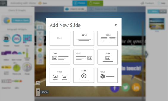
Online presentation software has quite a few options PowerPoint does not. For example, Visme has plenty of available preset templates, as well as the ability to easily share a presentation. Many presentation sites include libraries of preset images and animations to use, and sites like Visme include the ability to create infographics to enhance your presentation.
In the modern day, it is easy to create a fluid, accessible presentation. With USB’s, laptops, online sharing, and even presentation software specifically online, transporting presentations has become significantly easier.
Presenting has become far cheaper, with potentially free presentation software available, as well as comparatively cheap software that can be used again and again.
Innovative features have been added to presentation software, allowing an individual to create interesting, artistic presentations with much less effort. Moreover, the presenter can create the presentations themselves, cutting down the need to reach out to another company or individual to create the slides, and allowing the presenter to tweak the slides to his or her heart’s content.
There are some downsides to modern-day presenting. With less worry about the cost of creating slides, and less worry about how much it’d take to get extra words or images added to a slide, many modern presentations can be bogged down by excessive text on a slide, which can make an audience feel overwhelmed.
Slides design tends to get less attention. This is likely due to the fact that now the presenter handles all aspects of a presentation, rather than just a few—a double-edged sword, if you will.
The fact that presentations can be tweaked can be useful, but, much like the above, is also something of a double-edged sword; an individual might find he or she has less time to practice the material, or may be so anxious about what is on the slides that he or she never truly feels ready to present.
There are several individuals who also believe that modern presentation software has taken some of the creativity out of presentation creating, though this is debated, and for good reason—a lax presenter may choose to take the easy way out, but there are plenty of creative individuals who create presentations that could almost be considered works of art.
One may wonder where presenting will go in the future. Perhaps newer programs will add more ways for audiences to interact—such as including voice recognition, where a presenter could say a word to move a slide or could reveal certain parts of a slide when an audience member gives the desired response—or will encourage presenters to put extra creativity into their work.
There is an old saying about remembering the past in order to shape the future. This seems rather applicable in this situation. Presentation software is an amazing step in the right direction, as it ultimately eases many of the burdens of presentation creating. However, remembering the good about presentation history—less information to a slide, preparing further in advance—can help make good software better.
How do you think presentation software might develop in the future? What would you like to see, and what are you grateful for? Let us know your opinions in the comments!


