The Easy WebContent Blog
The easy to use, do it yourself Site Builder and Website Editing System.
Author Archives: Payman T.
How Galaxy Promotions is adopting Visme for their business needs. (Case Study)

 Today we’re interviewing Sally from Galaxy Promotions, a small business and member of the Canadian and American Promotional Association. Sally came across Visme to see if it will help her improve and allow her to more easily market her promotional material for various clients. She has since upgraded to our Premium plan and is a regular user of Visme. Here’s a bit more insight into her company and how she’s putting Visme to work:
Visme, the faster, more stable all around awesome version has arrived
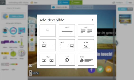 Announcing our most anticipated release yet. The new version of Visme: Faster, more stable, tons of new assets, and just all around more Awesome.
Creating engaging visual content in the form of Presentations, Infographics, and short animations has never been easier and our new version based on the feedback of over 65,000 users makes it even more intuitive and user friendly than before.
7 Experts Reveal Their Secrets: How to Use Visual Content to Attract More Readers (Part II)
Missed Part I? Read it here.
67% of your audience considers clear, detailed images to carry more weight than product information or customer ratings.
Smart marketers, educators and small business owners all around the globe are using visuals to make their message more effective and engaging. (more…)
7 Experts Reveal Their Secrets: How to Use Visual Content to Attract More Readers (Part I)

The Internet can be full of hogwash.
Sometimes you need quick answers and you want to make sure it’s accurate. How do you do that? By asking the right people who’ve put the strategies into use.
With that in mind, I got in touch with some of the leading experts who have combined their blogging with interactive visual content.
These guys are the real deal. They know they stuff and walk their talk. Pay close attention and steal away their secrets as they answer 4 key visual content questions below.
Enjoy!
Visualizing data with Infograph Widgets – A better way to present boring data
Let’s face it. Data can be boring. It’s often a conglomerate of a bunch of numbers and decimal points spread across a white page. It doesn’t engage with you; instead you have to make a conscious effort to understand and make sense of it, which is why it’s often hard to retain data.
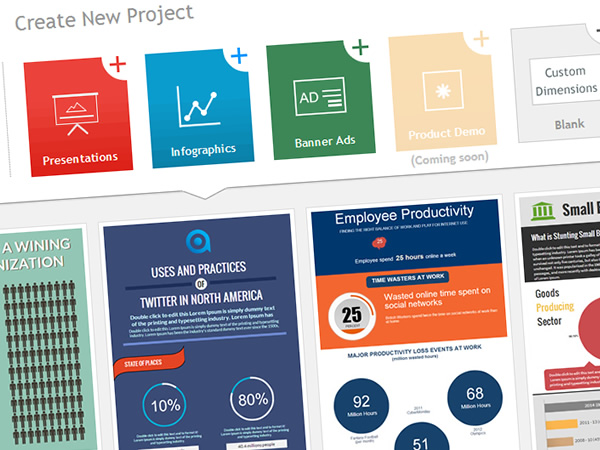
Awesome New Templates to Create Professional Infographics and Website Banners
The Visme user base continues to gain traction; we have thousands of projects created weekly by users from all walks of life. While we have been busy rolling out a lot of new refinements and features one thing was definitely lagging: Lack of Quality themes and templates.
Today we like to announce the first release (with more to follow) of a series of custom templates that will give users like yourself a great starting point to create better visual content.
5 Ways to Boost Traffic Your Website without Putting a Hole in Your Pocket
Let’s face it. We all want traffic. Lots of it.
Because without traffic, your website doesn’t solve its purpose.
Let’s say you’re a Biology teacher who also loves technology. You’re trying out some new online tools in class and see a boost in students’ performance when you blend lessons with these tools.
So you start a blog just to record and share your exciting findings. You review tons of free tools that you’ve used. Unbeknownst to you, this little blog is slowly attracting a decent traffic of 10,000 unique visitors a day. Soon you start getting “thank you” emails from other teachers looking for such resources online.
You also start hearing from other app developers asking you to trial their paid apps for free. Imagine what that could mean for you. You could start a sponsored app-review service. You can bundle up your blog posts and sell it as a report to your subscribers. You could even write an ebook on How-to use the top 5 tools in your market. Or make affiliate commissions from each app link.
The options are limitless.
How to create a Professional Mobile Friendly presentation in 5 minutes using Visme
Creating a Presentation doesn’t have to be hard or frustrating. It shouldn’t require different software and should be a quick and seamless process.
That’s a challenge we often faced at our Web consulting firm HindSite Interactive. Yes there is PowerPoint but it’s offline based and is a hassle to share among your colleagues or clients; then there is Google Slides and other online based presentations but they’re a bit too cookie cutter for our taste giving you the bare minimum to create sub-par slideshows.
That’s why we decided to take things into our own hands and create Visme (formerly called EWC Presenter). To create presentations quickly and easily while having total flexibility over design and tap into the clean templates and the thousands of free icons and assets when we need it.
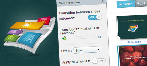
New features and upgrades for Visme, improving online presentations
We are keeping busy at Visme (formerly EWC Presenter). Over the last two months we have rolled out number of new features (and a ton are in process of being developed and rolled out this summer.
Our mission remains simple at it’s core: to allow anyone to create powerful engaging presentations and other infographics without any design or coding experience.
Here’s a recap of a few of our recent features and happenings which are reflected on all existing and new accounts:
Why and How we changed our brand name to Visme
If you haven’t already noticed, our brand has recently changed. As a company we are still Easy WebContent but our flagship product’s name ”EWC Presenter” is now officially called “visme” and for good reason.
Now most of the time this is where most companies stop short of the details. They will show off their new brand and pitch how proud and excited they are of their new name and how it is a reflection of their core values; and then its back to business.
Not this time. Yes we are proud and excited to transition our brand to visme, but we also like to do things a little different here. So today I’m going to dig down under the skin and into the nuts and bolts of why we decided on our name change, and how we made this transition including the entire logo design and selection process.
Blog Categories
- Experts Answer (2)
- Featured Story (94)
- How To (70)
- HTML Editor (7)
- Reviews (8)
- Site Builder (24)
- Tutorials (5)
- Visme (42)


