The Easy WebContent Blog
The easy to use, do it yourself Site Builder and Website Editing System.
Author Archives: Payman T.
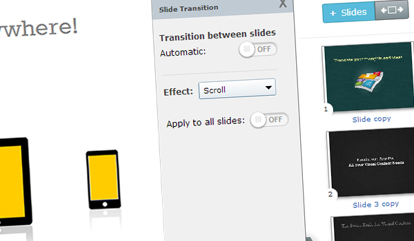
How to automatically transition between slides in a Presentation in just 2 minutes
We have been receiving requests (or should we say complaints) over the last few months from multiple users who wanted the ability to create transitions that occur automatically between presentation slides.
You see up to this point you could create multiple slides (or as some call it slide decks) using Visme (formerly EWC Presenter) but could only allow viewers to manually click on the control icons or right/left arrow keys to transition between slides.
But some of you just wanted to automate this process; ”Why should I not be able to assign an automatic transition to my slides if I want to?” asked one user, and another complained “Why in the world do I have to do all my animation in one single slide if I want to have it automatically transition from one scene to another? It’s kind of frustrating..”
Today we’re glad to announce that you now have further control over your presentation and animation transitions! It’s so elementary but as user feedback proved, it was absolutely necessary to many.
Announcing the release of the Layer Widget
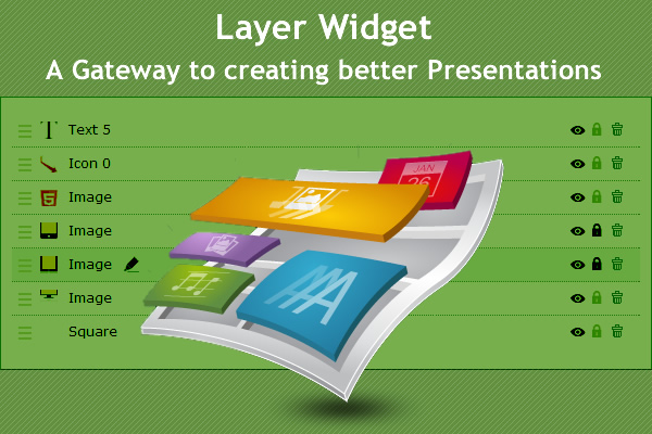
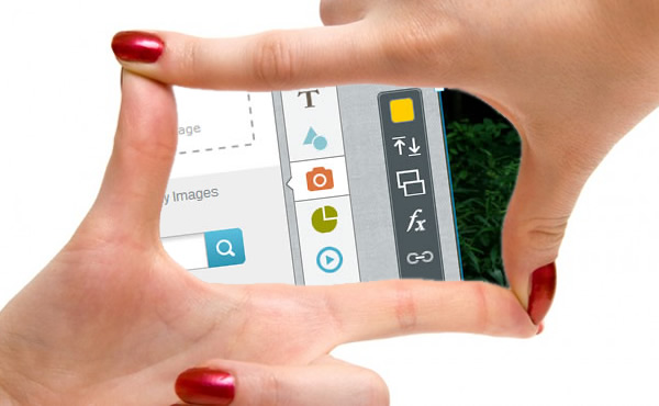
Yes you heard it right; you now have complete control over every single layer of your project from one central area with our recently launched Layer Widget.
In a nutshell this new feature consolidates a number of existing features that are spread over different areas of the application and centralizes them under one tab. It’s extremely simple and highly effective in improving the way you manage and order every element of your project and I’m confident it will become a stable in your content creation process.
Managing Presentation Backgrounds just got a whole lot easier
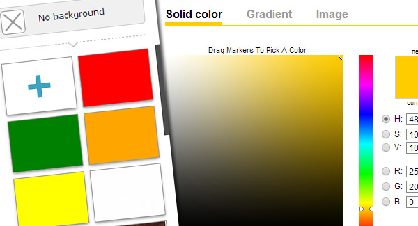
Announcing the release of our Background Widget. It was so necessary that you may be wondering why in the world didn’t we do this sooner! (Well that’s partially because we are working on over 25 other refinements and upgrades and this was just one needle in our haystack)
Over the last couple months we have received number of requests from users asking for an improved background feature. You see previously a user could pick their background once and then that was it; you had no further simple access to update the background or replace it. Some of the users found a work around by doing a band aid solution by putting a layer such as box or image over the existing background. That’s too many steps and it was time we did something about it.
EWC Presenter Interface gets Responsive
We’re excited to announce the second phase of our interface upgrade: Responsive Design. A couple weeks ago we launched a brand new interface that has dramatically improved user experience because it is simpler, cleaner and gives the user more real estate for their project area over its predecessor.
Today we have also deployed responsive design to the interface to further improve user experience. Here’s how it works and what it means for you:
How Carter International Concierge uses Presenter to promote their business
Every so often we like to feature Presenter users who create real life projects to raise awareness about their services, offerings or about their favorite cause. Today we are featuring Michelle, a Small Business Owner in east coast of the U.S. who is one of the earlier adopters of Presenter in our Beta Period.
Take a peak below to learn more about Michelle, her business and why she uses Presenter to better promote and market her business.
Easy WebContent launches brand new interface for Presenter
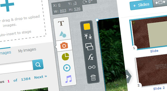
Down with the Old, Up with the New: Today we announce the release of a new major upgrade of our cloud based Visual content creation tool Presenter which allows everyone with little to no experience to more easily turn ideas into professional Presentations, Infographics and Banners right in their browser.
The new interface has been fully redesigned from the ground up to dramatically improve user experience for new and existing users. It is based on months of extensive user feedback, usability testing, flat design trends, and last but not least the demand for a front-facing UI (User Interface) that will support the release of new features to improve system capabilities in the months to come.
How you can create more engaging user experiences.
Fact: Every 60 seconds more than 571 websites are created, WordPress users alone publish over 347 blog posts while Facebook users share over 684,000 piece of content and twitter users send over 100,000 tweets. (Source: http://www.visualnews.com/2012/06/19/how-much-data-created-every-minute/ )
It’s a jungle out there my friends! So how in the world will your content be appealing enough for your audience to be worth their time and read past the first few lines and hopefully share with their circles?
5 Essentials for Visually Appealing Websites
Think of your website as your digital store front. Just as you would diligently clean, organize and display your best work to attract clients, your website should be equally tidy and well-kept. According to a recent study by the 2012 Digital Influence Index, 89 percent of customers search the web before making a purchasing decision. In this ever-changing digital age, it’s increasingly important to make a lasting online impression in a short period of time. When it comes to visual web appeal, it’s more than just pretty fonts and colors, it’s about the right mix of aesthetics and functionality that speaks to your target audience.
(more…)
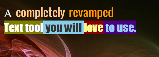
What’s new on EWC Presenter? A completely revamped Text Tool
We’re excited about this new release. For months we have had users asking us to improve our Text tool. It was at time buggy, and didn’t render text clean enough where everyone can appreciate. But today things have changed and let me dig in and tell you why and how:
You see our text tool was based on Canvas text in HTML5 (in laymen terms the default vector text when using HTML5 canvas) and although this had it’s advantages over time it became apparent that the cons far outweighed the pros.
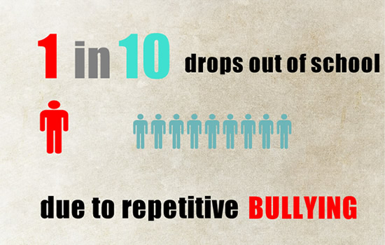
Cyber bullying and its effects on victims Interactive Presentation Case Study
Every so often we like to feature Presenter users who create real life projects to raise awareness about a cause. Today we are featuring a student William Yang, a 10th grade student from California, U.S. who came across Presenter and is using it as a great visual platform for a public service announcement about Bullying and it’s effects and consequences.
Take a peak below and make sure you check out the 4 minute interactive presentation. William has done a wonderful job of timing his animation with visuals, music and introducing effects to visually connect with his audience.
Blog Categories
- Experts Answer (2)
- Featured Story (94)
- How To (70)
- HTML Editor (7)
- Reviews (8)
- Site Builder (24)
- Tutorials (5)
- Visme (42)


