I recently was invited to do a Presentation in Northern Virginia’s Techbreakfast about our new Web Application EWC Presenter (Short for Easy WebContent Presenter) and I was quite surprised at the feedback I received. (You can read about a blogger’s experience attending the event here: http://www.moderndcbusiness.com/easy-web-content-presenter-is-drag-n-drop-simple.html
But first let me tell you the story of how this all came about. Around 18 months ago me and my team set out to take on a difficult challenge – to disrupt how interactive content is created – I knew there will be some level of interest in a tool that can help creative and non-creative people to more easily develop web and mobile friendly content, but boy was I in for a big surprise.
I had a reality check set in 2008:
I had always been an avid Flash designer. In fact at my design firm HindSite Interactive which I founded back in 2001 over the years our business thrived on designing interactive websites (remember those cool flash sites?). We did some exciting work from 2008 Elections for ABC News to Educational cartoons for National Tropical Botanical Gardens and our own award winning website’s flash version www.hindsiteinc.com were all designed with Flash and have won multiple accolades.
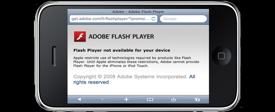
But something terrible happened to interactive side of our business. Apple launched iPhone and iPad and neither supported the Flash plugin; without it any content created with flash would simply not load on those devices. Go ahead and try to pull up our flash site www.hindsiteinc.com on your Apple mobile devices and you can see or I should say, you can’t see it.
Given Apple was the leader in Mobile devices, Flash began to take a backseat overnight. Many of us Flash enthusiasts tried to fight against the wave and refused to accept the demise of Flash as we knew it, however Apple’s market share kept growing and you can only tread so much water against a strong current and over time one by one many of us realized that end of flash as we knew it was over.
So we waited for a tool that would replace Flash and allow us to continue on our path of creating interactive content, but a tool worthy of being used at a professional level never came. Yes there were a few applications that rolled out but frankly they were either too limited or too buggy including Adobe Edge’s beta version.
That’s when we decided to take things into our own hands. If no one else is building a product worthy of us using it, why the heck aren’t we building one? After all we ate and breathed animations and interactivity for the last decade, so who would be better to create an app that speaks the same language. And so that is how it all started.
Looking back a few years later in hindsight it was all for the better:
- Flash is no longer abused by designers as it was before. The fact is as Flash became more and more powerful some designers (including yours truly) began to go overboard. To distinguish our work from the designer next door we reserved to more effects, longer intros and animations and we forgot all about the importance of usability.
We lost track of what was most important: Usability and user experience – which is the ability for a user at a sub-conscious level to find their way around a site (or application) without requiring a forced or conscious effort. Usability must be fluid and intuitive and abuse of flash affected this in a negative manner. Now we can’t blame this on Flash itself, but the designers who became irresponsible over time with using it.
The need for the right App:
The market is ripe for a great app to simplify how interactive content can be created and viewable at same time on any device or platform.
And this takes me back to my original statement: People are hungry for a game changer and Easy WebContent Presenter will help to solve this.
It’s been a big challenge to say the least!
At times my team members would tell me we’re trying to accomplish too much at one time within one product. No one has been able to develop a scalable HTML5 App that can create a number of different types of content and do it well within one App while remaining intuitive and easy to use.
In fact back in October 2012 which was initially set as our Public Beta launch date, I decided to pull the plug on the launch just two weeks before it was to happen. Why? Because our focus group testing strongly indicated there were some core usability issues and system was not stable as we wanted it to be for Beta.
So I made a decision: there will be no official Beta launch date. We will take as long as we need to establish a strong and stable foundation of our system in place and revamp the entire user interface before we go Public Beta. And I am glad after months of upgrades and adjustments to the system we are finally come mid April 2013 ready to open up our application to the public.
“I knew in my heart users including myself are craving for an intuitive App that simplifies the way interactive content is created and that it would be so awesome to be able to use a single tool to create presentations, infographics, product demos, banners and so much more without it taking you endless hours.” This is why we built Easy WebContent Presenter.
Why is Presenter a Game Changer?
EWC Presenter is not your average Web Application. Often apps are made to solve a single problem, but that is not the case with Presenter. It is created for the purpose of solving multiple problems and challenges users face when it comes to creating professional content:
It generates Web and Mobile Friendly Content:
The growth of Mobile is unprecedented. Virtually everyone owns a Smartphone or Tablet and so you can no longer fully depend on a desktop as the “web”. Web is Mobile and it is here to stay.
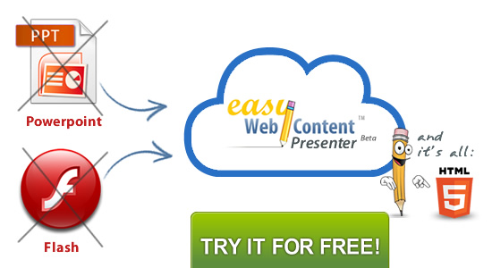
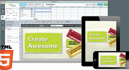
Presenter creates web and mobile friendly content because it is entirely based on HTML5, an upgrade to the native language “HTML” supported by every standard browser and platform be it Apple’s iOS, Google’s Android or Microsoft. And it requires absolutely no plugins and no installation, and best of all HTML5 is here to stay and over the next year will be recognized as a standard by the W3C.
So you know what you create in Presenter will be web and mobile friendly on publish, so your viewers can view your content on any of their smartphones or tablets and their PC or Macs.
Balance of Power and Ease of use:
Let’s face it, pretty much any application that is meant for professionals is cumbersome and difficult to use by the average person. This is often because professional tools are powerful and must provide control over many variables; As a result their user interface is bulky and requires a high learning curve that is too difficult for the average person.
In the other hand, applications that are set-up for the non creative person are simple to use and to achieve this most custom variables are eliminated. This makes for less flexibility and little control and customization so you often end up with cookie cutter boilerplate content.
That’s not the case with EWC Presenter. We went through three versions of our interface, number of iterations and multiple rounds of focus group testing before opening up our Public Beta to reach a balance that can appeal to the creative professional and everyone else.
I believe we still have room for improvement in this area and as we get more user feedback we will continue to make adjustments to the user interface to further refine it for our audience.
HTML5 not Flash
There are other tools out there but most that have stable and strong functionality are based on Flash and we feel it is becoming an outdated technology. HTML5 in the other hand is just scratching the surface of it’s potential and given the fact that is native to all browsers supporting it and requires no plugins makes it a great technology to base off of.
The con of HTML5? To achieve some of the effects and animations in our system has been a big challenge to say the least. We could have easily achieved them if we had resorted to Flash, but we chose to build the entire application on HTML5 because it would have the best long-term benefit to our users and the type of fluid content they can create across all devices.
We’re giving you a toolbox not a wrench or a screw driver:
And last but not least is the scale of our system. We like to think of Presenter as a Toolbox that has the potential to become an ecosystem of hundreds of powerful and customizable widgets allowing you to create content across a series of verticals in a fraction of a time.
Imagine dragging custom built multi-layered icons and graphics to your stage and be able to in a few clicks modify it to present the visual cue you want to achieve. What would traditionally take a designer and developer hours to create and code can be done in a few mouse clicks.
And what about tools like Powerpoint, Keynote, Prezi, and others?
We’re not here to replace other tools, we’re here to consolidate multiple apps into one easy to use powerful tool. We have nothing against Powerpoint, Prezi (which is great at what it does), Keynote and others. We just believe we can do it better and give people the choice to try our system and decide for themselves which best fits their needs.
From where I’m standing EWC Presenter is truly got the potential to disrupt how great content is created.
Stay Tuned; because we’re just getting started
I have never been so excited about a product as I am excited about EWC Presenter. The fact is we faced a ton of technical challenges and at times wondering if the vision I had was even possible.
Here’s what we’re doing
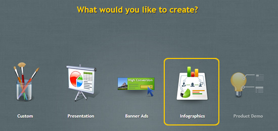
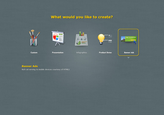
We are starting with four content categories and will roll out more in the future. We’re moving at 100 miles an hour and have built a great architecture and I’m proud of the number of technical and usability challenges we have been able to overcome and look forward to helping all of you Create Awesome content.
There is a ton of cool features and improvements on the way. We’re just getting started!
Meanwhile go ahead and make sure you create your account if you don’t have one and make sure to keep visiting our blog and the App as we will roll out upgrades weekly.




Have you any plans to incorporate PowerPoint uploads and audio narration into your presentation tool? Whoever offers what SlideRocket used to offer will have a true winner on its hands.
Hi Paul
We sure do. Both of these features are in our production line; so we hope you sign-up and begin using our app and we’ll be making those feature available to users in the near future (ETA few months). pass the word around!
I have an HTML 5 web page, that might have something like this:
__________________________
Enter Your ID |_________________________| ?
When the user clicks on the question mark the screen goes gray and a voice enabled character (page) pops up explains what goes into the field, asks the user to enter the data checks the data and if all is well places the information in the input box, disappears, and the gray is removed. So hosting on your website is not an option unless I can have the user input somehow returned to me.
Or I can put the source code of the popup page on my website. I am also open to any other suggestion.
Charlie
hi Charlie; Honestly not clear on your question and what you refer to. You may want to contact our support for further assistance.
I’m really interested to know if Presenter will include the options that SlideRocket had in terms of embedding live Twitter feeds.
Hi Justina
Soon you’ll be able to import Powerpoint right into Visme, and the embedding of Twitter among other feeds will be coming later this summer!. You should join and create your free account. and we’ll keep you updated with new features.