The Easy WebContent Blog
The easy to use, do it yourself Site Builder and Website Editing System.
Category Archives: How To
Want Free + Beautiful Visuals for Your Business or Social Media? Here’s How
Hola! At Visme HQ, we’re working tirelessly to convert complex into beautiful.
Our eternal goal is to let you grab a cuppa, sit back, relax and create awesome visuals with as much as of a click of a button. (Psst… it doesn’t matter what type of visual you’re after – we’ve got something for every need!)
7 Experts Reveal Their Secrets: How to Use Visual Content to Attract More Readers (Part II)
Missed Part I? Read it here.
67% of your audience considers clear, detailed images to carry more weight than product information or customer ratings.
Smart marketers, educators and small business owners all around the globe are using visuals to make their message more effective and engaging. (more…)
7 Experts Reveal Their Secrets: How to Use Visual Content to Attract More Readers (Part I)

The Internet can be full of hogwash.
Sometimes you need quick answers and you want to make sure it’s accurate. How do you do that? By asking the right people who’ve put the strategies into use.
With that in mind, I got in touch with some of the leading experts who have combined their blogging with interactive visual content.
These guys are the real deal. They know they stuff and walk their talk. Pay close attention and steal away their secrets as they answer 4 key visual content questions below.
Enjoy!
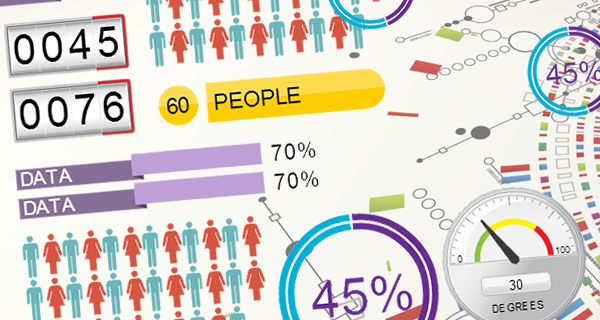
Visualizing data with Infograph Widgets – A better way to present boring data
Let’s face it. Data can be boring. It’s often a conglomerate of a bunch of numbers and decimal points spread across a white page. It doesn’t engage with you; instead you have to make a conscious effort to understand and make sense of it, which is why it’s often hard to retain data.
5 Ways to Boost Traffic Your Website without Putting a Hole in Your Pocket
Let’s face it. We all want traffic. Lots of it.
Because without traffic, your website doesn’t solve its purpose.
Let’s say you’re a Biology teacher who also loves technology. You’re trying out some new online tools in class and see a boost in students’ performance when you blend lessons with these tools.
So you start a blog just to record and share your exciting findings. You review tons of free tools that you’ve used. Unbeknownst to you, this little blog is slowly attracting a decent traffic of 10,000 unique visitors a day. Soon you start getting “thank you” emails from other teachers looking for such resources online.
You also start hearing from other app developers asking you to trial their paid apps for free. Imagine what that could mean for you. You could start a sponsored app-review service. You can bundle up your blog posts and sell it as a report to your subscribers. You could even write an ebook on How-to use the top 5 tools in your market. Or make affiliate commissions from each app link.
The options are limitless.
How to create a Professional Mobile Friendly presentation in 5 minutes using Visme
Creating a Presentation doesn’t have to be hard or frustrating. It shouldn’t require different software and should be a quick and seamless process.
That’s a challenge we often faced at our Web consulting firm HindSite Interactive. Yes there is PowerPoint but it’s offline based and is a hassle to share among your colleagues or clients; then there is Google Slides and other online based presentations but they’re a bit too cookie cutter for our taste giving you the bare minimum to create sub-par slideshows.
That’s why we decided to take things into our own hands and create Visme (formerly called EWC Presenter). To create presentations quickly and easily while having total flexibility over design and tap into the clean templates and the thousands of free icons and assets when we need it.
Why and How we changed our brand name to Visme
If you haven’t already noticed, our brand has recently changed. As a company we are still Easy WebContent but our flagship product’s name ”EWC Presenter” is now officially called “visme” and for good reason.
Now most of the time this is where most companies stop short of the details. They will show off their new brand and pitch how proud and excited they are of their new name and how it is a reflection of their core values; and then its back to business.
Not this time. Yes we are proud and excited to transition our brand to visme, but we also like to do things a little different here. So today I’m going to dig down under the skin and into the nuts and bolts of why we decided on our name change, and how we made this transition including the entire logo design and selection process.
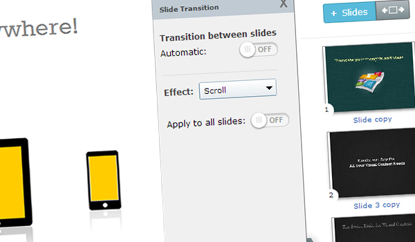
How to automatically transition between slides in a Presentation in just 2 minutes
We have been receiving requests (or should we say complaints) over the last few months from multiple users who wanted the ability to create transitions that occur automatically between presentation slides.
You see up to this point you could create multiple slides (or as some call it slide decks) using Visme (formerly EWC Presenter) but could only allow viewers to manually click on the control icons or right/left arrow keys to transition between slides.
But some of you just wanted to automate this process; ”Why should I not be able to assign an automatic transition to my slides if I want to?” asked one user, and another complained “Why in the world do I have to do all my animation in one single slide if I want to have it automatically transition from one scene to another? It’s kind of frustrating..”
Today we’re glad to announce that you now have further control over your presentation and animation transitions! It’s so elementary but as user feedback proved, it was absolutely necessary to many.
Announcing the release of the Layer Widget
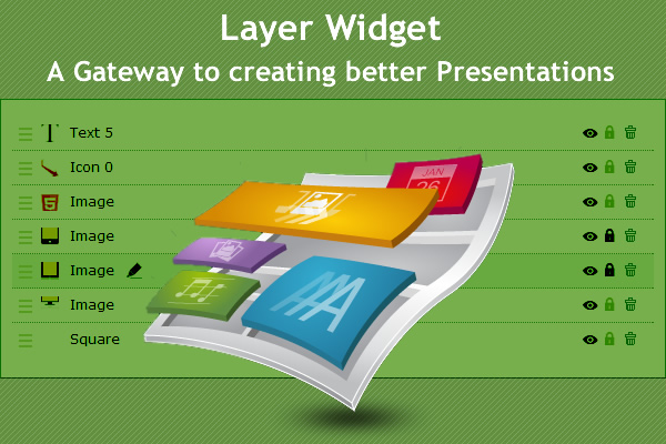
Yes you heard it right; you now have complete control over every single layer of your project from one central area with our recently launched Layer Widget.
In a nutshell this new feature consolidates a number of existing features that are spread over different areas of the application and centralizes them under one tab. It’s extremely simple and highly effective in improving the way you manage and order every element of your project and I’m confident it will become a stable in your content creation process.
Managing Presentation Backgrounds just got a whole lot easier
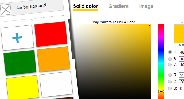
Announcing the release of our Background Widget. It was so necessary that you may be wondering why in the world didn’t we do this sooner! (Well that’s partially because we are working on over 25 other refinements and upgrades and this was just one needle in our haystack)
Over the last couple months we have received number of requests from users asking for an improved background feature. You see previously a user could pick their background once and then that was it; you had no further simple access to update the background or replace it. Some of the users found a work around by doing a band aid solution by putting a layer such as box or image over the existing background. That’s too many steps and it was time we did something about it.
Blog Categories
- Experts Answer (2)
- Featured Story (94)
- How To (70)
- HTML Editor (7)
- Reviews (8)
- Site Builder (24)
- Tutorials (5)
- Visme (42)


