The Easy WebContent Blog
The easy to use, do it yourself Site Builder and Website Editing System.
Category Archives: Visme
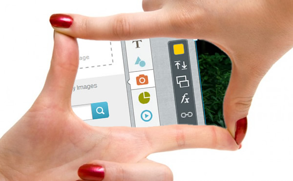
EWC Presenter Interface gets Responsive
We’re excited to announce the second phase of our interface upgrade: Responsive Design. A couple weeks ago we launched a brand new interface that has dramatically improved user experience because it is simpler, cleaner and gives the user more real estate for their project area over its predecessor.
Today we have also deployed responsive design to the interface to further improve user experience. Here’s how it works and what it means for you:
How Carter International Concierge uses Presenter to promote their business
Every so often we like to feature Presenter users who create real life projects to raise awareness about their services, offerings or about their favorite cause. Today we are featuring Michelle, a Small Business Owner in east coast of the U.S. who is one of the earlier adopters of Presenter in our Beta Period.
Take a peak below to learn more about Michelle, her business and why she uses Presenter to better promote and market her business.
Easy WebContent launches brand new interface for Presenter
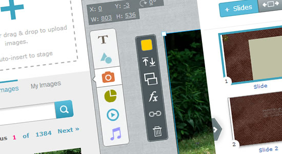
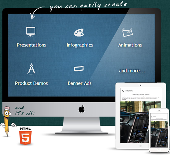
Down with the Old, Up with the New: Today we announce the release of a new major upgrade of our cloud based Visual content creation tool Presenter which allows everyone with little to no experience to more easily turn ideas into professional Presentations, Infographics and Banners right in their browser.
The new interface has been fully redesigned from the ground up to dramatically improve user experience for new and existing users. It is based on months of extensive user feedback, usability testing, flat design trends, and last but not least the demand for a front-facing UI (User Interface) that will support the release of new features to improve system capabilities in the months to come.
How you can create more engaging user experiences.
Fact: Every 60 seconds more than 571 websites are created, WordPress users alone publish over 347 blog posts while Facebook users share over 684,000 piece of content and twitter users send over 100,000 tweets. (Source: http://www.visualnews.com/2012/06/19/how-much-data-created-every-minute/ )
It’s a jungle out there my friends! So how in the world will your content be appealing enough for your audience to be worth their time and read past the first few lines and hopefully share with their circles?
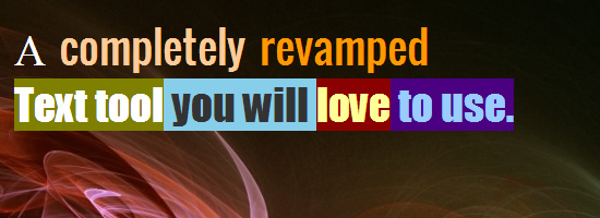
What’s new on EWC Presenter? A completely revamped Text Tool
We’re excited about this new release. For months we have had users asking us to improve our Text tool. It was at time buggy, and didn’t render text clean enough where everyone can appreciate. But today things have changed and let me dig in and tell you why and how:
You see our text tool was based on Canvas text in HTML5 (in laymen terms the default vector text when using HTML5 canvas) and although this had it’s advantages over time it became apparent that the cons far outweighed the pros.
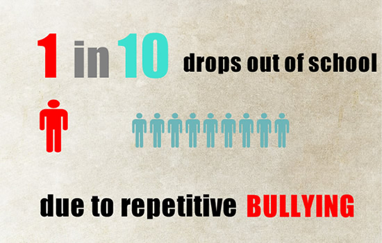
Cyber bullying and its effects on victims Interactive Presentation Case Study
Every so often we like to feature Presenter users who create real life projects to raise awareness about a cause. Today we are featuring a student William Yang, a 10th grade student from California, U.S. who came across Presenter and is using it as a great visual platform for a public service announcement about Bullying and it’s effects and consequences.
Take a peak below and make sure you check out the 4 minute interactive presentation. William has done a wonderful job of timing his animation with visuals, music and introducing effects to visually connect with his audience.
The SlideRocket alternative and replacement is Presenter
Lately we have seen a lot of conversations and tweets about SlideRocket users voicing their frustration and complaints about SlideRocket’s upcoming shutdown and looking for a good alternative.
If you have been a SlideRocket user, we invite you to join EWC Presenter and its growing community of users and adopters.
The turtle is turning into a Rabbit!
Design faster in Presenter
Over the course of the last few months thousands more users have joined and created series of Presentations, Animations, Banner Ads, website teasers, Infographics and more right in their browser using Presenter. Some of you are students and educators and some are non-profits, businesses and bloggers.
How to add presentation or animation to my wix website
Do you have a website on the Wix site builder and you’re wondering how you can make your website stand out from the millions of other sites out there?
Adding interactive banners, presentations or animations will help you to achieve that and the free App EWC Presenter will allow you to do that right within your Wix website.
Aside from creating a clean and professional layout, you should also strongly consider adding engaging and attractive content that will capture your user’s attention. After all studies continue to prove that combining text with visual cues and animation can enhance user’s ability to absorb information which is ultimately why they visit your site.
How to make a professional Slideshow Presentation without being a Pro

Photo credit: Victor1558 | Flikr
A great Slideshow Presentation can make a huge difference between becoming a winner or loser. Although you don’t necessarily need to be a professional designer to create slides that grab user attention. To start you just have to find a great idea and a great tool to visualize what is on your mind.
Here are few simple steps to achieve this
Blog Categories
- Experts Answer (2)
- Featured Story (94)
- How To (70)
- HTML Editor (7)
- Reviews (8)
- Site Builder (24)
- Tutorials (5)
- Visme (42)


