Creating and managing professional websites just got a whole lot easier!
It’s early 2013 and we start off the year fresh with a complete overhaul of the Easy WebContent Site Builder Interface. It’s been a big undertaking where our design and development team dedicated hundreds of man hours hacking our way through a ton of code to fully refine the entire application layout to better fit the needs of our users so they can create and manage professional websites and access system features easier than ever before.
We are excited about this release as it not only simplifies the process of building more professional websites, but it opens a new avenue for us to further scale our system and release of new widgets that will further allow control over your site layout.
“This new release is a trigger for many more enhancements and refinements that will follow with our Site Builder in the coming months. It not only simplifies the process of creating websites, but also serves as a foundation to deploy new widgets and features to our growing user base.” Said Payman Taei, President of Easy WebContent, Inc.
So what’s new in our Interface?
We have refined the application layout to solve a few concerns our users had raised over time:
- Better use of real estate within the application
- Easier access to content widgets
- Faster access to Style properties panel
- Improve emotional response and user experience
Let’s take a closer look at some of these refinements:
Better use of Real Estate:
Previously virtually all properties and widgets were located at the top via a horizontal panel. Although this had some advantages, it was outweighed by a few restrictions:
- Reduced visible area of site layout
- Too many tabs to click through to access Content widgets and style properties.
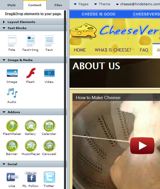
To solve this we modified the panel structure. Rather than having Content and Style tabs open horizontally, we shifted them to the let of the application and organized each tab into clickable tabs for quick and easy access. In turn we have reduced the number of clicks it takes to access Content widgets and Properties from an average of 4 clicks to only 2. Our beta test results showed speedier design and site management over the prior set-up.
- New Easy WebContent Site Builder Interface (Single click to access all primary sections)
Easier access to content widgets
In the old interface you had to move all the way to the top of the panel to access content widgets. But that is not the case in the new set-up. Now you can more easily access all widgets from one panel.
Faster access to Style properties panel
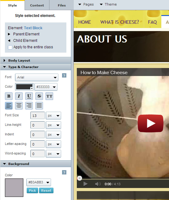
Our experiments showed moving the widget panel to the left resulted in a subtle yet noticeable improvement in user experience. This update reduced the distance a mouse travels from an element on a page to properties under style tab. Given the fact that during design a user will frequently use style properties, this update will improve user experience and speed during design and styling adjustments.
Additionally you no longer have to do multiple clicks to access all style property options. They can all be visible from the left panel and closer proximity to your page elements.
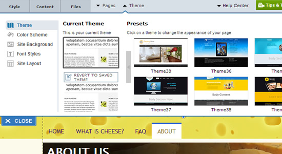
Top Panel
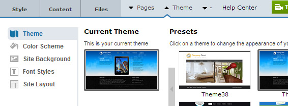
To maximize real estate space of visible site area, we consolidated the space dedicated to the top panel, simplifying tab names and moving them closer together.
The result is a cleaner and smaller panel area that allows user to access more areas of the page and scrolling less to access it.
But wait there’s more…
There are other subtle improvements from cosmetic to minor spacing and rendering improvements to enhance the user experience. They may not seem obvious from a quick look but if you are an existing user, you will notice numerous minor updates accross system features that will improve your overall experience.
But this is just the beginning! We have lots of new features and improvements on the way. From new widgets to further interface enhancements are on the way and best of all they will roll out free to all existing subscribers.
Why the redesign?
We are called Easy WebContent; and as our name suggests it is our mission to simplify the ability for everyone to create professional looking websites quickly and easily.
It’s thanks to our user base and their continual feedback that has helped us to pinpoint sticking points in our applications and improve them to create a more seamless experience.
But there is something special about our system: Personalization. Just as no two individuals are alike, the same applies to your business and in turn the most important marketing tool at your disposal: your website. Every business and brand is unique; it must portray your culture, your offerings and your business model and these need to be reflected on your website.
And that’s why a cookie cutter template won’t cut it. You may look at 1,000 templates and choose one that is close to your needs but nearly 100% of the time you want to make certain adjustments to the template to make it your own. And that’s where Easy WebContent Site Builder shines through compared to other competitors. We like to pick up where others leave off.
We strive to give you the tools and widgets to have total visual control over every element of your website. The fact is, we’re never fully satisfied with our work, and this is what keeps us going and think of what else we can do to further improve upon our applications.
If it’s been a while since you used our Site Builder or never tried it before, its time to take the initiative and give it a try and see how it works for you.


Pingback: See the upgraded version of Site Builder Interface to create … | Add My Site Web Development News
Hey there, You’ve done an incredible job. I’ll definitely digg it and personally recommend to my friends. I’m sure they will be benefited from this site.