Photo credit: Victor1558 | Flikr
A great Slideshow Presentation can make a huge difference between becoming a winner or loser. Although you don’t necessarily need to be a professional designer to create slides that grab user attention. To start you just have to find a great idea and a great tool to visualize what is on your mind.
Here are few simple steps to achieve this
1. Come up with a general idea for your presentation. It helps if you have a particular reason for making a presentation, such as using slides as illustrations for your public speech or creating an animated user guide. Otherwise you may get some inspiration for your own piece from other people’s presentations, pictures or videos.

Photo Credit: Tsahi Levent-Levi | Flikr
2. Organize the information and materials you already have. Put all the digital files related to your presentation together in one folder. When doing this you will get multiple benefits:
- all relevant text documents, pictures and media files are easy to access;
- you can easily review what you have to get an idea of your assets;
- when looking at the files you might use for your slideshow you are getting ideas on better ways to apply them.
3. Plan a logical flow of your presentation. It does not need to be a real plan drawn on paper. You may create it in your mind. Just take a moment and think what information should come at the beginning, how to engage a viewer with the first slide and how to put an end to your presentation.
4. Find user-friendly and efficient software for creating interactive presentations. Note that the software should offer stylish templates and graphic elements, handy tools to modify and customize your slides along with an intuitive interface. Last but not least – it must be able to produce a slides which are viewable on every device. There are several popular tools like Flash, PowerPoint, and EWC Presenter. Flash used to be the gateway to interactivity but it’s demise has been result of not being supported by mobile devices. Powerpoint remains a popular tool but has it’s limitations or a learning curve for creating professional slides.
Not everyone knows that Presenter by Easy WebContent is actually a handy online tool that gives you a wide range of options to customize an interactive presentation. EWC Presenter combines all the best: advanced animation control tools (like in Flash), easy, intuitive workflow and pre-built templates, icons and effects (like in PowerPoint). Add to that cool free graphics and ability to share your presentation online, save it in different formats and view on any platform.
5. Start building slides using the chosen software. In the beginning it helps to take it easy – open any pre-built template you like and start adding your own titles, text, pictures and icons. As appetite comes with eating, inspiration comes within creative workflow. As soon as you begin to compile visual elements, an idea on how to rearrange and modify your slides can come instantly.
6. Use only suitable items. Generally a presentation should contain graphic elements designed in a similar style. This gives it continuity and a cleaner feel. Avoid adding pictures or icons which do not look good together with other slide components. If you are short in pictures, you can always find plenty on them using free online services (free photo stocks, Flickr and similar resources). The other good idea is to use complimentary icon and other graphic elements gallery (usually a good presentation software has built-in galleries).
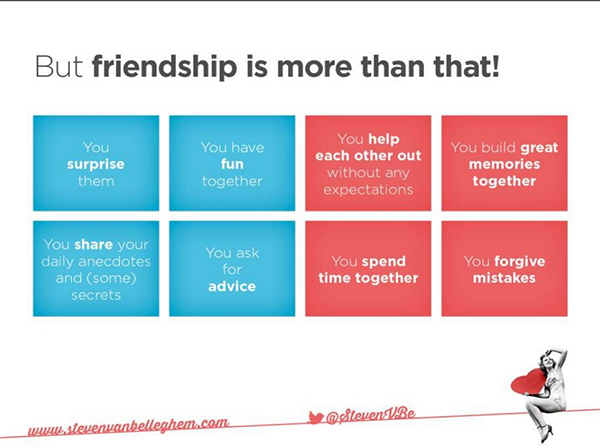
7. Try to stick to a unified color scheme in your presentation. It means using the same color and color combinations for background, titles, text, frames, shapes and icons throughout all the slides. It makes your slideshow look very neat and stylish as if it was designed professionally.

Image Source: Steven Belleghem | SlideShare
8. Leave some empty space in your slides. A lot of people tend to pack their slideshows with as much information and graphic as they can. But it makes slides hard to read and understand. That’s why it is so important to leave some empty space which separates different sections. Blank canvas helps viewers to focus on key blocks instead of shifting their eyes around the slide hopelessly trying to find the main idea.
9. Make it short and highlight the most important information – less words more action. Formulate every issue in just one brief sentence, turn it into a big title and add an expressive picture. It works much better than tons of text typed in 10 point font.
10. Add some action to engage a viewer. Help a viewer to absorb information quickly – give short ideas one by one. Using animation effects add more fun to your presentation. Arrange the logical order in which elements must appear on canvas. Choose several built-in animation effects you like the most and use them for all of the slides. Don’t forget to add enough time to let your viewers read each slide thoroughly.
Tips
- Avoid unreadable text (small fonts, distracting backgrounds)
- Do not use music or sound effects in your slideshow unless it is appropriate to do so
- Check and review the overall presentation before finishing. Make sure all the items are on the right places and all the effects play smoothly
- Save your work every 5-10 minutes in order not to lose everything because of a software failure
- Respect copyrights to the images and media used in your slideshow
- Synchronize your speech with animated slide effects, rehearse several times to adjust animation speed to your speech pace
Warnings
- Avoid unreadable text (small fonts, distracting backgrounds)
- Do not make too many slides. Everything between 10 and 25 is a pretty good number
- Don’t upload large media files into your presentation – it will slow down the software you use and the reply to your users.
Here’s also a good blog post that covers the how to’s on giving great presentations.


How does this differ from Perfect Pitch24?
hi. It varies a bit. EWC Presenter is not just a Presentation application. It allows you to create virtually any type of visual content from Presentations to infographics, banners and everything in between. A new version coming soon that will also leap the app closer to our goal allowing anyone to create engaging content right in their browsers.