Consider this: Your brain is mainly an image processor (much of our sensory cortex is devoted to vision), so doesn’t it make sense that when you want to engage others whether in business, education or other forms of communication you utilize visual cues?
We are highly visual beings
Think about it. When you meet someone for the first time the initial sensory triggers are visual. You don’t for example first wonder how a person sounds or what their personality is like; instead you first glance at the visual cues. It is the first thing you are presented with. Imagine the first date you ever had; from a male perspective we often first look at the face, posture and the curves, while majority of females pay attention to the height and clothes of their counterpart.
The roots of visual cues are deeply embedded in various aspects of our lives. Visual perception is a part of our culture and it has been since our great ancestors; and in case of communication it is extremely important.
Let’s look at it from a brand perspective. A brand is the foundation of an entity and it is used to fuel the marketing of products. It can make or break companies. Think Coca Cola. It’s simply sugar water and caramel color, infused with carbon dioxide. But do you see it as just a mixture of a few inexpensive ingredients? Or when you hear the name Coca Cola do you think of the red and white color and the fontstyle and all the smiles it represents. As a result for generations it has become one of the top recognized brands in the world.
Let’s also look at Apple. The culture and the products are based on simplicity of design thanks to the somewhat addictive personality of the late Steve Jobs and his deep passion for clean design. Apple’s logo , and product line ooze simplicity. The brand gives you visual cues to the clean simple interface, the soft curves and the feel of software that powers it. Apple understands visualization and they are damn good at using it in all aspects of their marketing.
The list can go on. Call it superficial, but no matter what you call it, we as humans are visual beings so it makes perfect sense when engaging others you do so in a visual manner.
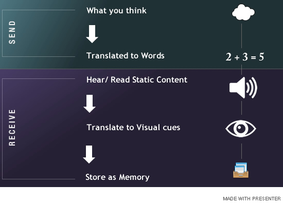
This is where visualization and interactivity comes into play. To communicate we often translate what we visually think and see as words and gestures which are then formed into speech, blogs, articles, books and so forth. Your audience will read or hear this content and in turn visualize the content to understand and store it as long term memory.
Think about the last book you read. As you read pages of content your mind tries to perceive what each character and scene looks like. Often you have to resort to prior experiences to create a picture of what your reading. And every so often you come across a sketch or drawing in between chapters which greatly enhances your perception of what the writer is trying to portray to you.
The combination of content supported by visual cues does wonders to how the reader is able to better understand and absorb the content presented to them. And that is why static content supported with visual elements greatly enhances the rate of your audience understands and stores the information presented to them.
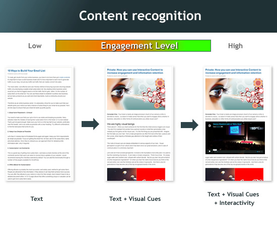
Let’s take a mini quiz. Look briefly at each item below for 5 seconds and look away. Which one do you remember moments after you look away?
Now let’s play the animation below; It’s the same information from the examples above but it contains a touch of interactivity. Play it and see how with each passing moment your visual cues combined with simple text and content is soaked up like a sponge by your mind.
Here’s the kicker. In two days look back to what you saw on this article and think about which of the three examples you still remember something about. (Tip: It’ll be the interactive example)
You may not remember every detail, but you will recall intermittent frames; and once you remember and visualize a piece of something it opens up the possibility for your mind to try to stitch together the missing frames.
Images get embed deeply into our minds and are easier to retrieve than a paragraph of content explaining the picture.
I believe a combination of interactive content and motion graphics are the ultimate visual cue to get a message across.
Great, but what dtoes this all mean for you? A whole lot.
If you ever need to present information to an audience (be it in writing as a blog, a resume, a presentation in person or online) regardless of the audience your utmost goal is to connect and allow your audience to understand as much of the information as possible. And this is where the utilization of visual and interactive content comes into play.
Don’t take my word for it. Consider the numerous research that backs up this notion:
“Overall animation increases performance with better learning results and less effort. However, visual cues rated better than replacing visual text with spoken text. Multimedia materials using both words and pictures have the highest instructional efficiency for retention and transfer. (Source University of South Alabama)
This is why TV Ads are one of the most effective means of branding. Don’t believe me?
Here’s a simple test. Think about the last Advertisement that you remember from the past few months. Was is it a static banner on some site or newspaper, a colorful magazine print Ad, or was it an Ad you saw on TV? The first things that come to my mind are:
1- The new Jaguar F-type commercial
(a gorgous red sports car to compete with the big boys)
2- The iPhone Ad’s recent Camera Promotion (More people take pictures with iPhones than any other handheld device)
3- Oh and the very low budget Ad from “Do you need cash now?” (So annoying I can’t help to remember it)
They all have one thing in common: They’re short and communicate the pitch in a visual and interactive manner.
Now for the majority, TV Ads are too expensive or not even needed. For many the audience is a small niche group; whether in a classroom, a corporate meeting or web audience you should seriously consider using Interactivity within your content.
Note the word “within”. This is not about replacing the form of communication you are using, but instead enhancing or supplementing visual and motion into your existing work. You may already write great content and it may do just fine by itself, but it could grab your user attention and enhance retention if it also utilized visualization.
For example if you are a blogger you want to continue creating blogs but consider supporting your articles with images and visual representations.
Take this blog post you are reading. Rather than giving you strictly text, I have used a variety of graphics and interactive features to support my content. Although the article is long it is broken into piece with visual content and broken into multiple short paragraphs. Most visitors will scheme through the content and read what catches their attention. So further more visual cues will increase the content stickiness.
Don’t forget balance
As with anything else, the key is moderation. Use interactivity in a clean and simple manner because your brain can only absorb so much. (How much of the last Star Trek movie’s special effects do you actually remember?) Two hours of non-stop action packed extravaganza where t you remember just glimpses of the action in key areas much. Why? Because your visual cortex can only absorb so much at any given time.
Give it too little or too much and it will be counterproductive; give it a good balance and it will make a noticeable difference.
“It is also important to recognize that when creating materials to keep them brief, concise and on topic. Adding additional topics in an animated format can become confusing. Irrelevant, although sometimes interesting, facts can result in lower transfer performance.“ (Source: University of South Alabama)
Make it Meaningful and Creative and it will be effective.

Enough about the importance; by now I’m sure we’ve proven the point on the importance of visualization of content. So let’s talk about the approaches you can take to incorporate it into your own work.
The fact is all forms of communication translate to some form of content, but not all translate to meaningful content. As a communicator translating your message into an easy to understand format (and one that is memorable) should be at top of your list.
When and where should you incorporate interactivity to your content?
For most the communications are short to medium pieces of content formed into individual documents, articles, blog posts or even presentations. Integrate visual components to support your content to increase engagement and information retention.
A rule I like to follow is when I come back to read through my own content, if I don’t understand or unable to comprehend it after one quick read, it is either not well written or requires further support to visualize it. So I may include multiple images and interactive elements in one blog post and other times I may include only a piece or two. It really depends on the length and the scope of the content being written.
How can you create more Engaging Interactive Content?
There are number of options, some you have to pay for and some are free. For the average person most of these tools are either too limited or difficult to use and require a high learning curve. I have listed tools I have personally used before and experience with each one:
PowerPoint and Keynote: Two well knows presentation programs that pretty much started the presentation craze. PowerPoint is from Microsoft and Keynote is from Apple. Both are desktop based applications that must be installed on a computer. They’re okay for creating static Presentations, but when it comes to creating highly visual and interactive versions you need to go through the learning curve.
Pros: Everyone has heard of PowerPoint and most of Keynote. They Can work offline and save your work locally. Can create simple presentations with limited interactivity pretty quickly.
Cons: They can only be installed on your computer you have license for. Limitation in publishing content on the web as it is not a hosted solution. And both tools have limitation in interactivity unless you spend the extra time to bring in graphic assets from other programs and learn the animation features.
Photoshop: The king of image and photo editing from Adobe. Virtually every professional designer and photographer utilizes it.
Pros: Very powerful. Great for professionals and offers a lot of filters and features if you take the time to learn your way around the user interface.
Cons: Costly and high learning curve. Not really meant for the average Joe. It’s also mainly for static images not interactive content. And be prepared to pay a few hundred dollars or more to purchase.
Flash: Formerly a product of Macromedia and later Purchased by Adobe, Flash is a great animation tool and up until around 2009 was the interactive tool of choice for the web. Not an image editing application but mainly to add motion to your content.
Pros: Fairly powerful and tool of choice for nearly all professional web designers for interactive content up to 2009/2010.
Cons: Costly. The tables have turned against flash since Apple stopped supporting it on their mobile devices. Flash requires a plug-in to play. Content you create will not be viewable on iPhone / iPad devices. Flash also has a bit of a learning curve and not really meant for the beginner user.
Prezi: is a web-based presentation application. It’s a little different than PowerPoint and Keynote which are based on multiple Slides. Prezi is more like a giant slide where you lay your content and can zoom in and out to different areas of the slide to tell your story.
Pros: It’s free. It has a unique transition effect; you can zoom to areas you want user to concentrate on as you tell a story. You can create neat presentations as long as you spend some time to learn how to manipulate the transition to fit your story.
Cons: It’s also based on Flash so you need to use a Flash plugin or their free player on mobile devices to view the content. You are also pretty much restricted to one type of transition (zoom in/out). I sat through a medium length presentation and started to feel a bit of vertigo.
Presenter: A fairly new Web Application that has taken the most popular features of PowerPoint, and Flash and combined them into an easy to use cloud based application that allows creation of not just Presentations but animations, infographics, banners and other interactive forms of content.
Pros: It’s free. Cloud based so you can access it anywhere and with multitude of publish options including ability to post to any website or blog (the animation on this blog is an embed of a Presenter project), push projects to your social network, or download as standard image or PDF format. Last but not least published content can be viewed on any device including Smart Phones and Tablets.
Cons: It is in Beta as of June 2013. Although becoming highly stable you may once in a while find a small issue here and there.
Google Slides: Google’s take at an online based version of Powerpoint / Keynote. It’s very light and thus offers general functionality for very basis presentations. If basic is your cup of tea Google Slides might be for you.
Pros: It’s free. Very simple tool for creating basis Presentations. If your familiar with PowerPoint and Keynote, the principals of using Slides is the same. It’s cloud based so you can access it from anywhere.
Cons: Sometimes too much of a good thing is a bad thing. Simple can mean boring and with Google Slides it’s really mean to generate simple slide shows with basic transition effects. If you want to create a fairly engaging experience you’d need to rely on bringing your own graphics and assets and find it difficult to go beyond the simple transitions it offers you.
These are just a few examples. I could list many more, but they are the ones I’ve personally used and my experience with them. You can try what works best for you. I’m Personally sold on Presenter; perhaps I’m biased but the truth is it has some key advantages over other apps and it’s what works for me.
You see your content can have true potential to grab your audience!
So here we are. By no means do I consider myself a good writer; english was not my best subject. But if you made it this far then I got your attention long enough to get you through this long article assuming you’re not one of those readers who skips the cool stuff and jumps to the end of an article.
Now imagine if there were no images or any interactive components, you may have found the length of this article overwhelming and lost your interest.
Have you used Interactive content in your communication? Like to hear your experience with them. And if you haven’t used any of the tools mentioned you should definitely give them a try to leverage your communication skills.
Want to learn more about creating professional presentations that engage your audience? Check out my Ultimate Guide: 10 Rules on How to Create Professional Presentations that gives you great insight into this.


 Payman Taei is the Founder of HindSite Interactive, an award winning web design and


