Updates. Possibly the most exciting part of maintaining any sort of program. You build something to perform a task, and when things take a little shift in the wrong direction you want to make it right. Also, you want to make it better. Whether you want the program to perform better, look better, or simply act like it was designed, you set a goal to update. The outcome can be measured success, or measured defeat. So, when EasyWeb Content decided to update their interface it was a chance to experience the site builder all over again.
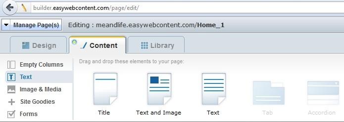
There were two noticeable changes. First, and most obvious, was the separation of “Site Theme” from the Design tab. The original interface looked like this:

If you clicked on the Design tab you could choose “Site Theme” and the themes would show up in a long row. Now, the interface looks like this:
 As you can see, “Site Theme” is now its own drop-down menu, and when you click it the themes show up in two rows. This is actually a good direction to go. Instead of making the theme a part of the smaller design features, the theme is now its own idea. You can choose a theme and not have the rest of the design features tagging along unless you purposefully go looking for them. If you want an already established theme you can choose one and there is no push to make it your own. Also, minimizing the themes into two rows instead of one long row makes the themes easier to compare and select.
The second update to the interface, and the most intriguing for me, was the new Files tab. Before there was the Library tab, and that was a bit complicated to look at. Not to mention your uploaded files weren’t easily accessible. Now, however, the Files tab opens into a drop down menu that clearly shows what you’ve uploaded, the name of the uploaded file, and the size of the file. You can see your files in list form, or thumbnail form. It’s brilliant. No messy URL link, no wondering how to reuse the image you just uploaded, just a place to see all that you’ve added and the ability to use it all again.
Of course, the whole look of the interface has change just by the simple shift of “Site Theme” from subtitle to drop-down menu. There is a cleaner feel to the whole thing. Not to mention the ease and simplicity of the new Files tab. Overall, I think the new interface was a good update; it was a success.
You Are In Charge Easy WebContent provides easy and powerful tools to manage and empower websites. It gives the user control to edit an existing or build a new professional website. VisitEasyWebContent.com today to begin your free 7-day trial period!


