Announcing the release of our Background Widget. It was so necessary that you may be wondering why in the world didn’t we do this sooner! (Well that’s partially because we are working on over 25 other refinements and upgrades and this was just one needle in our haystack)
Over the last couple months we have received number of requests from users asking for an improved background feature. You see previously a user could pick their background once and then that was it; you had no further simple access to update the background or replace it. Some of the users found a work around by doing a band aid solution by putting a layer such as box or image over the existing background. That’s too many steps and it was time we did something about it.
Starting today you can at anytime access and customize backgrounds for your page, and if you haven’t got to know us by now, we like to always take things one step further and make it easier for you.
Here’s what you can do now:
Transparency
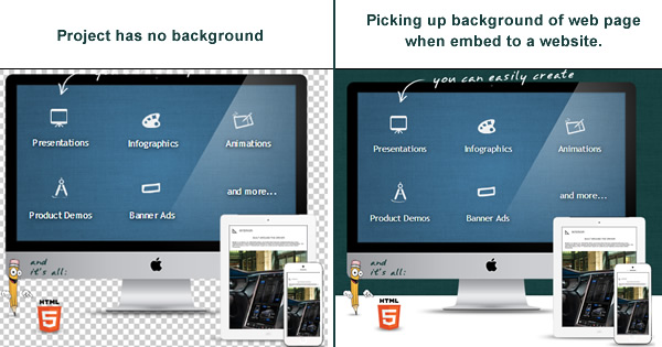
You can assign a transparent background to your project. This is very useful for designers and website owners/bloggers who want their website’s background to show through.
For example one may create a big banner or animation and want only the content of the project to be embed over their website and allow their website background to show through.
We actually did this on our own site www.visme.co where you can see the iMac LCD Display sit perfectly over the site’s background texture behind it as shown below:
Default Backgrounds
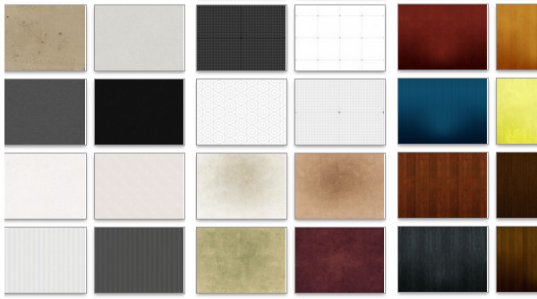
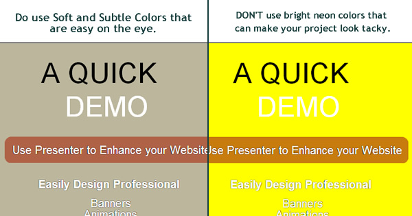
I’m the first to admit; looking back we had some ugly backgrounds. So we looked through thousands of projects our users created and noticed some backgrounds were hardly ever used, hence it was time to get rid of them. Instead we replaced most of our backgrounds with softer more professional textures and backgrounds that will not overtake your Presentation content. We’ve introduced number of new backgrounds; and we’ll be adding more as time goes on.
Add your own custom Background
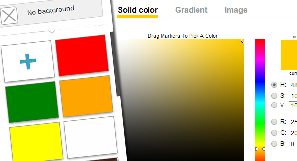
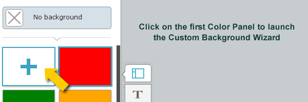
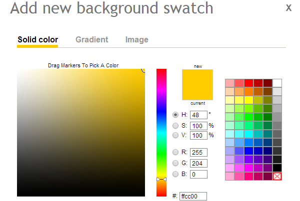
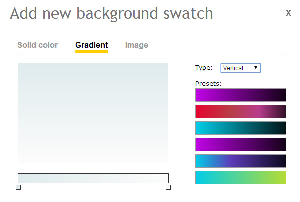
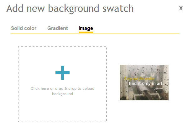
Here’s where things get really exciting. You can literally add any type of background now. Just click on the empty slide and it will launch the custom background widget.
Check it out:
Solid Color: You can select from available preset solid colors or custom build your own color. Choose from millions of possible color combinations!
Gradients: Choose from preset Gradient options or create your own custom gradient. You can have little as 2 or more gradient points.
Image: Upload your own image to use as a background on your project.
How to access the Background Module
It’s simple and easy to use and that’s what makes it awesome.
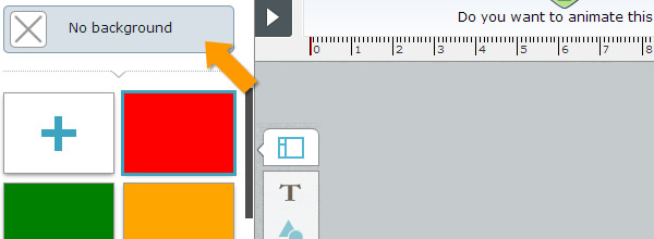
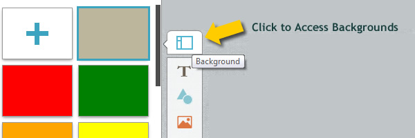
1. To access it from within your project just click on the Layout icon on top left
Oh and why does it look like a layout icon and not a background you might ask? (’cause we got some cool stuff to roll out under this area in the coming months; more on that in the near future.)
2. Once in the Layout panel, select from the various default background options we provide.
Here’s some tips on using Background widget:
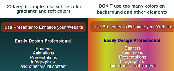
- Keep it simple; Remember this is the background of your project; It’s sole purpose is to give some depth/dimension to your project. But don’t go crazy choosing drastic backgrounds that can hamper the content that is placed over it.
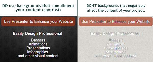
- It’s all about your content not your background. So whatever background you choose, make sure it has good contrast with your content. It should compliment it, not overtake it.
- The Background you choose will follow through all slides of your project (assuming you have more than one slide). So stick to a specific theme and color and maintain it throughout your project.


 Payman Taei is the Founder of HindSite Interactive, an award winning web design and


