We’re drowning in words. There is simply too much information around us that we can possibly consume. We don’t have the time to sort through and grasp the amount of information that comes to us.
And guess what? Your customers think in the same way.
Over the past few years, Big Data is defined in many different ways. Some have looked at it negatively, as something we should be afraid of. Whereas other marketers have embraced it.
Simply put, Big Data is a collection of data from both traditional and digital sources, from outside or inside companies that can be used to later make an analysis. (Forbes)
It is the exponential growth of available data at our disposal today. This data is either structured, or unstructured.
There are several ways Big Data can help businesses unlock significant and valuable information. For starters, information that is transparent is more readily available and usable. Using the information, companies can segment and target their customers better.
Data never sleeps.
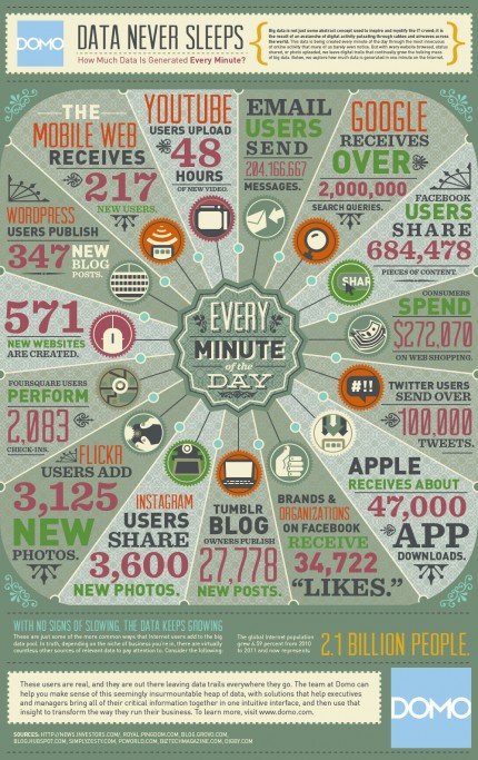
For example, every minute, Google gets over 2 million queries. Facebook users share 684,478 pieces of content per minute. Check out the below infographic for more mind-blowing stats:

Source: DOMO
The point?
Big Data is here to stay. For a very long time. Maybe forever.
And with so much information being generated every minute, it becomes hard to make sense of it, serve it or analyze it.
At times, you also want to present this information to your customers in an easy-to-digest, structured, clear and compelling manner.
Then there is the factor of shareability – you want your information to go viral, be shared on several social media platforms too. Right?
In fact, KissMetrics estimates that creating a viral campaign could have an effect that’s 500?1000X that of a non-viral campaign. That’s a much better ROI.
Making Sense of Big Data with Infographics.
An infographic lets you represent complex information in a simple manner. It is especially ideal for “deep data” or a list of statistics, such as the ones in the above infographic.
Each day, 1.5 billion content pieces are born. Infographics are more attractive than boring text and help you pave the way that’s crowded with data.
What’s more, the human mind is wired to be receptive of visual data – plain text can distract us very easily where as visuals have the power to hold our attention for longer.
Let me explain.
Think of a presentation where the presenter moved from slide to slide, each chock-full of text. You hardly remember a thing that was shared, right?
Now, contrast that with the experience you had when the presenter hardly put anything on the slides, except for relevant and catchy visuals.
Moreover, if you want your customers to engage with you; stay on your blog or website for longer and share your content with their network, you want to share something beyond text.
How to create stellar infographics in Visme
No, you don’t need any fancy graphics skills to get started.
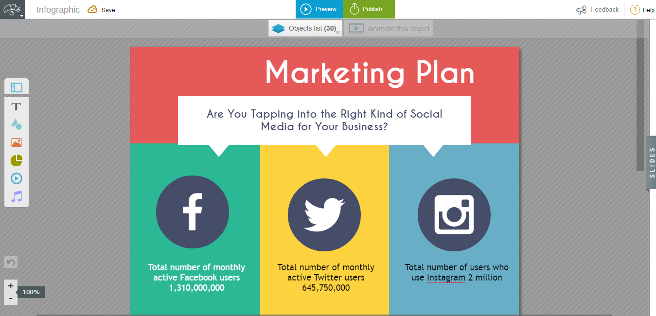
Because with a myriad of ready-made templates, Visme makes it super-easy to create your first infographic.
Steps:
1. Login to your account at www.visme.co.
2. Create a New Visme
3. Choose “Infographics” from the menu
4. Pick a template from the ready-made options (we have close to 50).

And voila! Start creating awesome.
Your Turn!
What do you think about the Big Data problem? How do you combat it in your business? To hold the attention of your customers, have your created an infographic recently? Share a link below!


