Let’s see. Would you rather sit through a boring Powerpoint presentation or have a root canal? Of course you may pick the presentation but if you were given a third choice, I bet you would take it.
The point is nearly all of us at one time or another have been through boring presentations. The last one I sat through was devastating. I literally took out my iPhone and started browsing TMZ.com to pass time.
Whether given in person or viewed on screen, a Presentation doesn’t have to be boring, it should be engaging. It should get your audience involved and get them excited (or at the very least interested) in what you’re showing them.
I’m going to break down the concept of a presentation and go through a checklist to help you create better presentations that will capture your audience’s attention.
Presentations are inevitable:
The word “Presentation” for lack of a better term often called “PowerPoint” or “Slidedeck”has become synonomous with a period of long, boring information forced upon the audience by the Presenter. But love it or hate Presentations do play an integral part of communication from business to education and everything in between. If used properly a Presentation can serve as the medium to externalize your story or idea.
Anyone who has ever used PowerPoint knows that they offer boring un-inviting templates that look like they were created a generation ago. And most of us at one time or another didn’t know any better and started with a default template, pasted loads of content and called it a Presentation.

But there is more to creating a Presentation based on boring designs and poor content.
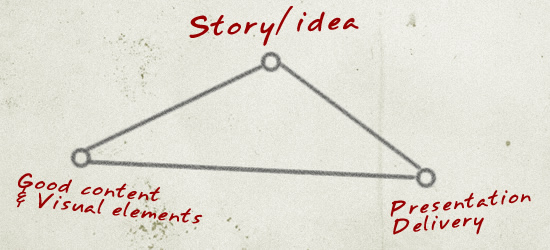
A professional presentation must be composed of a few key elements:
To create Professional presentations you would need to consider the following:
1. Know your audience
Before you write any part of your content, always evaluate your audience. Who are you writing for? What interests them? How can you connect with them? Think about the angle you can take to start your presentation that will set the tone for a positive experience with your audience.
2. Establish your message
What you say and how you say it will heavily impact the level of engagement. Your message should be clear and concise. It should at some level emotionally connect with them and deliver information in pieces that can be easily digested and assimilated.
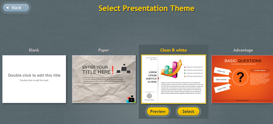
Your delivery platform: Your Presentation is only as good as the method of delivery. There are various popular software out there with the most popular being Microsoft Powerpoint and Apple’s Keynote. Both are downloadable software that require installation. The one I use for my Presentations is a recently launched cloud based app called Easy WebContent’s Presenter. It’s a big time saver and helps me to select from variety of handmade themes and a great starting point to create my Presentation and published version can be viewed on any device.
3. Keep it short and to the point
Things are different today than yesterday. We are hammered with tons of content every minute of everyday. From your facebook wall, TV Ads, tweets, numerous emails, text messages and not to forget the many pages you browse everyday; we want it bold and straight and real quick without the B.S.
Take this article for example. If I eliminate all visual cues and compact this fairly long post into long paragraphs with no breakpoints you may very likely stop reading and click away. Your audience is the same. Give it to them in pieces and get them engaged.
Act as if you are the reader of your own Presentation. Do you read or scheme through content? I scheme and perhaps you do too and so it’s more than likely your audience will be doing the same.
4. Tell a story and tell it well
Short stories are great. One way I like to go about it is to treat a Presentation as if I’m telling a story to a group of kids in a classroom. Why? Because kids tend to have a short attention span. They’re extremely smart when you think about it. I believe they are wired perfectly to filter out the noise from what actually interests them. They don’t want to hear nonsense; they’re just interested in content that is interesting and triggers their imagination.
I like to think there is still a reminiscence of a kid that survives in us even as we grow older. Your audience is the same way. They are there to get something out of your Presentation. Their time is precious and your taking it from them, so you better offer something worth their valuable time.
One of the best examples of presentations were given by Steve Jobs and Martin Luther King (among other great speaker such as JFK, and Roosevelt). There is always a statement or a phrases that survives beyond the Presentation, sometimes for years to come. (i.e. “I have a dream that one day…” ).
Nancy Duarte does a great job of explaining the way you can use a set of high/low moments in a presentation combined with short stories and trigger messages to compel your audience to follow you throughout your presentation.
5. Structure:
Give you Presentation a beginning, a middle and an end: an introduction, body, and an ending).
To visualize the structure of a successful Presentation Nancy discovered that they all share a common format from Martin Luther King’s speech, to Steve Jobs 2007 iPhone introduction and even the Gettsyburg address.
State a problem or a road block and then support it with a solution. You virtually move back and forth between what is and what could be, each time setting the tone for the next event. An example of Steve Job’s 2007 iPhone speech is shown below:
6. Segment your Presentation
Once you have established your audience and your topic you should break it down to segments and within each segment divide content you wish to present into slides.
Each slide can cover a single topic but make sure if you want to present more content to never squeeze it into one slide. It is far easier to grasp short bursts of content than long paragraphs or bullet lists that are squeezed into one slide.
Once you layout your topics, you would want to revisit each slide and see where you can achieve the high/low moments and variety (as covered in Nancy Duarte’s Presentation above).
Tip: First create your last slide. This will help you to not lose focus of the keypoint and call to action of your presentation. Then work your way to the last slide from the beginning.
7. Keep it visual
We are visual beings thanks to how our brains which act primarily as an image processor (did you know much of our sensory cortex is dedicated to vision?)
As a result Simple and easy to understand graphics can speak loudly to your audience and keep them connected. This is one of the reasons infographics have become so popular. They allows you to combine visual cues rather than boring content.
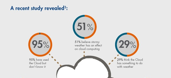
Let’s take a look at an example of a study on what Cloud technology over the internet. Here’s content in a data / bullet format:
A recent study revealed:
- 95% have used the cloud but don’t know it
- 51% believe storm weather has an effect on cloud computing
- 29% think the Cloud has something to do with weather
And here’s the same information in a visual infographic format:
Take a look at each for 10 seconds and look away. In a few minutes which will you remember the most? Studies show you will remember the infographic version (or at least remember some part of it versus general text/content.
So try to visualize your content as often as possible. When presenting data try to visualize it. Not only will this feel more welcoming to your audience but studies have continually shown that associating text with visual elements greatly increases information retrieval and retention (source Psychology Today http://www.psychologytoday.com/blog/get-psyched/201207/learning-through-visuals ) and that is exactly what you want to achieve; for your audience to remember and take away something from your presentation.
8. Get your audience engaged
To me giving a Presentation (be it in front of an audience or online) is very similar to driving a car.
Think of the driver as your target audience, the front windshield as the presentation (or stage) and the speed of the vehicle as the pace of your presentation.
Imagine being the driver. If you drive at a steady pace of 50 MPH your mind will eventually start to wonder specially when you don’t see any signs or road maps.
Have you ever realized how much more engaged you are with the road when driving through a combination of turns and various road blocks as you make your way to a destination for the first time?
You are engaged with your surroundings. You pay attention to signs and anticipate whether the next intersection will be green or red, and looking for the next sign and what clue it will give you next.
And what happens when you hit heavy traffic? Your vehicle comes to a screeching halt with constant breaks. Shortly this takes a toll and you lose momentum and soon bored and your mind starts to wander to other things.
Well that’s how a poorly formed Presentation can feel. You’re taking your audience for a ride and it’s up to you on how much visual cues will engage your audience. You get to set the pace and the speed of the presentation (remember the high/lows approach covered earlier in this post)
9. Get Interactive!
Speaking of engaging your audience try to get more interactive with your Presentation.
According to University of South Alabama (among many other research institutions) Animation has been proven to affect cognitive load; it increases performance with better learning results and less effort.
Creating interactive presentations used to be a big deal with traditional Presentation software because most are just really made to handle static slides and the animation effects are usually tacked on (for forced) onto the software. This can often complicate the ability to make your presentation interactive due to the steep learning curve and lack of the interactive effects.
Using EWC Presenter it gives you the means to easily create interactive effects via a series of Animation presets so in matter of seconds you can apply motion to any element you choose to animate.
But remember to not overdue it.
The misconception is animation can confuse visitors and be counterintuitive. This is true if you go overboard. When adding animation effects to your presentation keep it simple and clean and avoid forcing effects. You don’t have to animate every element on every slide. If you keep a good balance of combining animation effects with good content and visual cues you can increase the retention of your presentation and reach better engagement.
10. Last but not least? Leave them Hanging
A great foreign movie that won the 2012 Academy Awards was “A separation”
If you haven’t seen it , it’s worth checking out. The ending of the movie leaves you hanging. It’s one of those ending where the screen goes to black and you look to the person next to you and say; The end?
I never fully understood why the screenwriters do that until I realized at end of each of these movies I go on thinking about the ending for days on end. These endings trigger a response that makes you remember the movie and the likelihood you will go on thinking about it long after the movie has ended and discuss it with others.
That’s what you want to achieve with your Presentation. End it with a question; or suggestion. Leave them hanging or give a call to action that engages your audience.
If you are giving the presentation in person it will open the stage for questions and higher level of interaction with the audience. And if viewed on screen it can increase the likelihood they will take further action or at the least take something away from it.





 Payman Taei is the Founder of HindSite Interactive, an award winning web design and


Payman. You hit the nail on the spot. Helpful tips and I will be following your rules to improve my presentations in the future. This post deserves sharing all around.
p.s. That Presenter tool you recommended it’s fantastic! Loved the infographs. I hope you guys plan on rolling out more templates and themes in the near future?
Hey Joseph
Thanks. And yes we have a lot of improvements coming out. A series of new infographs are in works as well as new templates for each category. It only gets better.
Payman, Great article!
If a presenter knows his audience then only he will be able to design his message effectively. So, Knowing your audience is must.
I just love it when presenters add their personal experience in the storyline and use metaphors. Presentations should never be dead and boring, they should be interactive and engaging. Really loved these rules.
Thanks for sharing out them with us.
Arpit
authorSTREAM Team
Arpit. Thanks for the comment.
Your absolutely right. One can create the most interactive presentation, but if it’s not geared towards their niche audience it won’t connect with them.
Personal experience and storylines create a closer connection and give it a human feel. I think the closer you get to your audience when presenting information the better they will grasp your point of view.
Pingback: Useful links | Rhondda's Reflections - wandering around the Web
Pingback: How to create Content to increase user engagement and information retention
You’ve featured some great tips here, thanks for sharing them! I particularly like the Number 7) Keep It Visual – this is so important. Thank you