In Web Design 101 we covered the components that make up a web presence, and overview of how you can select the proper theme that can serve as a great starting point for your new website.
This is chapter 2 of a short series of articles about designing your own website and taking charge of your own web presence. By the time you go through these articles you will transition from a novice to a professional and in turn be well on your way to designing, populating and optimizing your web presence.
In this chapter we are going to dig further into customizing your website theme and tips on achieving a professional website format.
Note that if you are already satisfied with the theme you have selected and do not see a need to modify your layout and ready to populate it with content, you can skip over to Web Design 103 chapter where we cover details about Structure and format of your website.
Colors
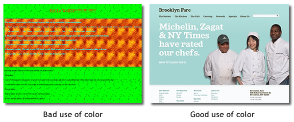
If you are a novice creating your first website, you may easily overdue the color scheme selection. It’s important to note that the proper use of colors can define a professional web presence. Colors affect emotional response with your visitors and attract or even distract from goals you are looking to achieve with your audience.
Too much of a good thing is a bad thing
Color is good but don’t over do it. A great example is McDonalds. When you pass by a Mcdonalds fast food chain you are immediately attracted to the bright red and yellow colors that entice you to walk in. But have you noticed within a short period of your visit you feel a bit anxious and soon have the urgency to leave the premises? That’s not just the smell of fried food, it’s the bright colors.
In case of McDonalds, it is intentional; the bright colors are meant to get you in, but also get you out a short time after. In case of your website you want to to achieve the opposite.
Afterall you work hard enough to get a visitor to walk through your home page, so you want to do everything you can to make them comfortable while keeping them engaged.
You would want to as a result take caution on the variation and color selection on your website. Avoid using bright colors on major real estate areas of your website such as backgrounds (or avoid them much as you can); Pastel colors are okay but they can also give a sense of a cold feeling to the real estate.
It’s not so much that there are wrong colors you should never use, but generally speaking you would want to avoid achieving a rainbow effect on your website and sticking to maintaining good contrast and a clean environment to support your content.
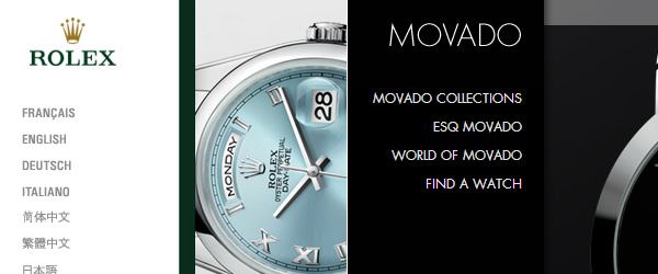
One of the simplest and harder to follow guidelines is to minimize the use of too many colors on a site. For example take a look at some of the leading brand websites and you can quickly notice the minimal use of colors. In fact some utilize no more than 1 or 2 colors but resort to shades of the same color.
This simple balance can work magic on enhancing the design and user comfort.
Your first intuition during the design process will be to work with as many color choices as you can. Avoid this! Instead try to remind yourself to utilize selected number of colors.
- Select 2-3 complimentary colors.
- Use can use shades of the same color but stick to only 2-3 colors.
- Pick a primary color which can occupy the background of your site and use a secondary or third color for your link or call to action area (buttons).
- Make one of the colors an accent color which you can use as a call to action (for buttons) to grab user attention.
There is also a great article about color selection you can view at your convenience.
How to select and customize your Color Scheme using Site Builder:
Now that you have a brief understanding of selecting colors, let’s apply it to your website layout. Let’s start with the Site Builder’s Color Scheme feature and then we can dig down to the Site Background feature shortly after.
There are over 45 (and growing) hand selected color schemes to choose from. You also have total freedom to modify the color to adjust to your own needs.
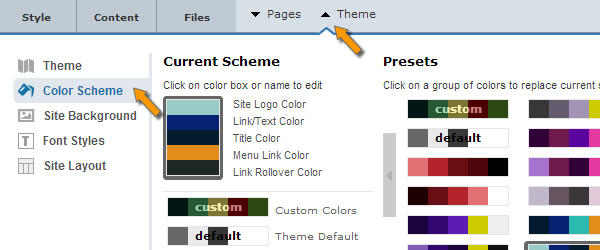
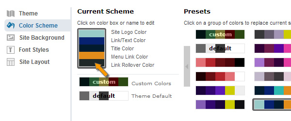
The global color manager can be accessed via the Theme > Color Scheme tab as shown below:
There are two options via the Color Scheme:
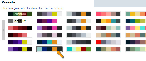
A). Select from preset colors. There are numerous color schemes available and you can simply click on one to find the one that matches your needs or close to it (as you can modify each color to fit your needs)
B). Use an existing color scheme and apply your own custom colors as shown below.
If you want to customize your own colors, you can click on each preset color to find the closest one that matches your needs, and then modify one or more colors until you reach the desired look.
Customizing the Color choices:
There are 5 colors associated with the style of each site. A short description designates the purpose of that color to the right of the color box.
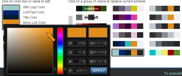
You can click on each color box and modify the color via the color picker which gives you millions of possible colors to choose from.
You can also enter an exact color you may have detected from another place. (the Hex color code and the RGB color input boxes allow you to input an exact color you may have decide upon)
Note:
1- When you apply different color schemes, you may not see drastic changes in color variation in your theme, depending on which theme you have selected.
This is because your theme may have a background image or have color applied to different areas that the color scheme is not overriding.
This is where the Elastic themes give you the ability to go beyond the restrictions. You can hand select your own colors on each block of the theme you want to update until you reach the desired look.
You can also go beyond the color scheme options included in the Site Builder you can search and select your own custom colors and update them on the Site Builder.
A good resource for color selection: http://www.colourlovers.com/palette/2702737/earthen_skies
2- Although a color maybe labeled for one section, it is possible for it to have been applied to more than one area. For example “Link/Text Color” below may also apply to Logo text color. As you make changes you can detect these variations and customize to achieve the desired feel. When this occurs you can go to that element, click on it and via the left panel Style tab > Background Color update to the color of your choosing should you need to modify it further.
Site Background Color:
This feature applies color to the entire background of your site, assuming it is not covered up by other elements or containers with their own background colors.
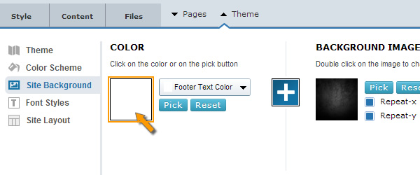
You can access this via the Theme > Site Background tab.
You have a couple options for your website background: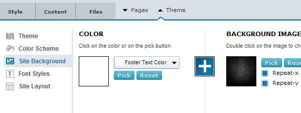
Color: You can click to apply any color you wish to your site’s background.
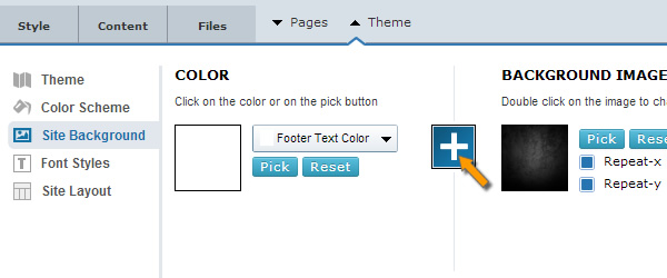
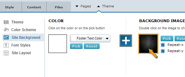
Background Image: You can enable this by clicking the “+” button (Blue indicates Background image is turned on). And you can Pick your own background image such as upload from your computer, or choose from existing images or library.
You can also decide if you want to repeat (tile) your image within the background real estate. For example you can repeat an image horizontally or vertically. The repetition depends on the size of your background image.
Note:
- Don’t overdue your site with background images. Keep it simple; Select simple backgrounds that don’t overpower ability for users to concentrate on the most important part of your site (Your content)
- The “+” icon between the Color and Background Image allows you to turn On or Off the Background Image option.
- The footer or header of your site may have their own color applied that will not be reflected by the Site Background feature.
In such cases you can individually customize those areas as covered later in this chapter. Each default theme comes with its own colors hand selected to balance the theme.
Applying color to global site elements
Using the Site Builder’s Style feature you can control virtually every single layer element on your website including the color (as well as borders and spacing).
Sometimes the main background of your site is covered by background color of containers that cover over the main background.
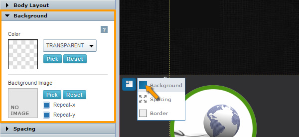
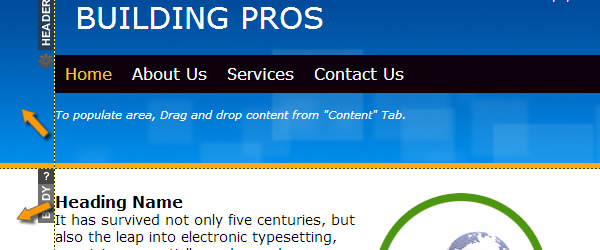
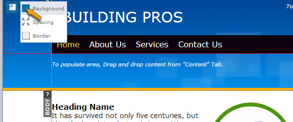
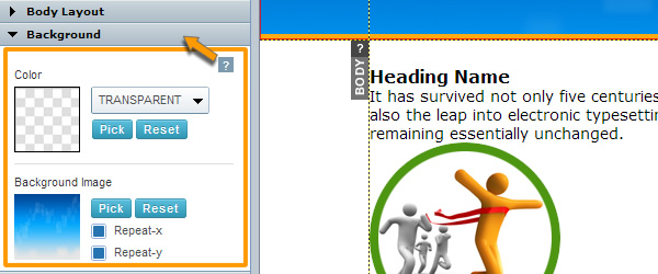
In the example below the background color is covered by the header’s background container. If you need to modify (remove or update) the container color, you can do so by:
1- Click on the area you want to modify the color
2- On the left panel (Style) tab, you can see the color or even the Background image of the container.
Select and customize your Font styles
Now that you have adjusted your website’s color scheme, it is time to customize the font styles on your website. Next to your site’s theme and its color scheme, the right choice of fonts can make a big impact on the professional feel of your website as improve readability of content with your visitors.
Important tips:
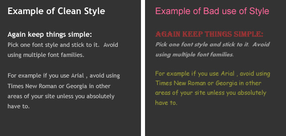
Again keep things simple: Pick one font style and stick to it. Avoid using multiple font families. For example if you use Arial , avoid using Times New Roman or Georgia in other areas of your site unless you absolutely have to.
Size Matters: Choose font sizes wisely. Don’t be afraid to make your Header/Titles large versus the body content. This helps to create size contrast and is easier on the eye to distinguish between sections of content.
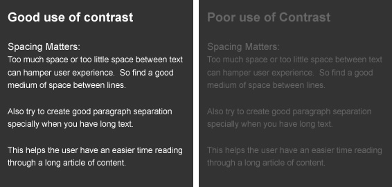
Spacing Matters: Too much space or too little space between text can hamper user experience. So find a good medium of space between lines. Also try to create good paragraph separation specially when you have long text. This helps the user have an easier time reading through a long article of content.
Select 2-4 font sizes and stick to them.
For example If your Header text is size 24; you should use that same font size on all headers of your site.
If your body content is size 12, then you should use the same font size on all body content of your website.
Don’t forget your viewers: After all this is the sole purpose of your web presence. Always look from your visitor’s eye. Try this: Read through a couple paragraphs of text on one of your pages. If you have a hard time reading it or can’t concentrate on the content, how do you expect your visitors to read pages of content when visiting your site?
Solution: Choose easy to read fonts that are easy on the eye. When you have large amount of content, apply a font size that is easy to read and separate your content with proper spacing and paragraph as well as title separation.
In addition make sure you have enough contrast between your content and the area it is placed over. For example avoid having white text over a light gray background, while it is perfectly okay to have white text over a dark gray or black background.
How to customize Fonts on your website using Site Builder
The Site Builder gives you you total flexibility over font management.
Set Fonts styles Globally: You can globally set font styles for your entire website (this can save you a lot of headaches avoiding the need to have to customize every content element of your website).
Set Font styles individually: You can go to any content element on any page and manually override the default font style.
How can you set the default fonts styles for your website?
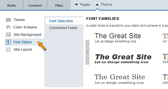
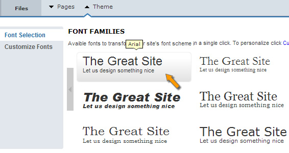
1). It’s easy. Go to Theme > Font Styles
2). You have two options: Font Selection and Customize Fonts.
The Font Selection will give you a series of font family to choose from. When you apply a font family it will apply to ALL fonts on your entire site. This allows you to quickly switch between font styles globally throughout your site without the need to have to apply it one by one.
Note: If you go to individual elements and modify their font and later come back to the Theme > Font Styles the new font family you apply may no longer apply to it. Because individual changes you make to a font will override the global settings.
This is why you want to always set your font family first and later make any subtle font changes you wish on your individual content blocks.
Customize Fonts for different font styles:
The Theme > Font Styles > Font Selection area is to simply set the Font Family of your website.
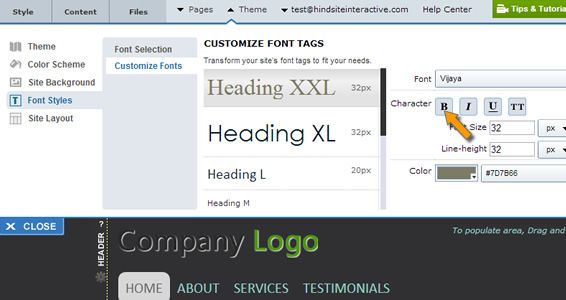
There is also another section: The Theme > Font Styles > Customize Fonts which is for applying custom font styles to specific font styles (Such as Headings, Body text, Menu Text, Active Menu text, etc.
From this one area you can modify specific font styles which would reflect throughout your site.
For example if you wish to Modify the Main Header of your site (Main Title; also called Heading 1) you can adjust it from this area.
There are multiple Heading sizes (Heading XXL, Heading XL, Heading L, Heading M, etc,,). Not all of these may be used in your theme, depending on which theme you have selected.
How can I detect which content is using which style?
it’s easy. Click on a content block; In example below user has clicked on the Title “About Us” and on left Style panel you can see the Font Style (in this case Heading XXL)
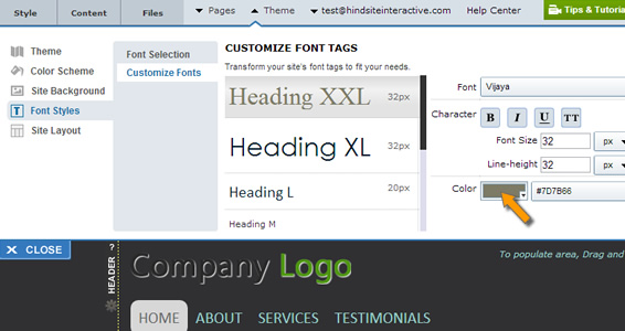
You can then go to the Theme’s Customize Font area and update the Color and style to your specifications.
Note: If you go to individual elements and modify their font and later come back to the Custom font styles section, the new font style you apply may no longer apply to it. Because individual changes you make within your page content will override the global settings.
And you’re now well on your way!
Once you are done with the color scheme and updating font styles of your website give yourself a quick pat on the back, because you are now officially ready to move to the next phase of your website! Things will start getting more exciting now.
Remember that it is okay if you are not 100% done with styling your site. What’s important is you have taken the time to establish the core design and styling of your website (about 80-90% of the style) which will help you to better structure and build the rest of your website. Along the way you as you add content and add more pages you may come back and make subtle adjustments to your theme to improve upon your web presence.
Now that you have established your website layout, the next chapter is to dig a bit deeper into the structure and format of your website which is imperative to having a professional web presence that can best serve your content and your audience. This is covered in Web Design 103 – The structure and format of your website


